Richard Ziade Answers Questions About Readability
Readability
Last week, after a long wait, Readability, the bookmarking and text-reformatting service, finally launched on iOS. Now that I have been using to for almost a week, I have a few more thoughts on how the app fits into my workflow, but more than anything I found myself with questions about the service itself.
So I contacted Richard Ziade, founding partner of Readability, to pick his brain about the iOS launch and the company’s future plans. He was only too kind as he patiently answered my questions over email. Here is what he said.
How has launch week been going? Crazy around Readability HQ?
Things are going great. The response has been just tremendous so we’re very excited.
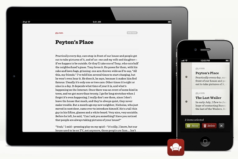
The Hoefler & Frere-Jones fonts featured in the iOS app are absolutely gorgeous, particularly on the iPhone 4/S retina display. Can we be expecting them to come to the Web app anytime soon?
That’s more of an H+FJ question. I don’t want to steal the thunder of any announcement they may want to make. But yes - they do look amazing!
H+FJ has been dangling Web fonts for a while. After seeing Jason Kottke’s redesign this week featuring the Whitney typeface, I imagine I’m not alone in wishing they’d make their way into Readability in a desktop web browser.
Agreed. They’re incredibly polished.
You’ve launched within other apps (Reeder, Pulse, etc.) but how different (perhaps necessary?) is it to have your own app on iOS?
It’s important because it helps with user adoption and gets the brand name out there, but make no mistake about it: we’re incredibly invested in the development community around Readability. If someone builds a better reading client than our own, we’ll be the first to stand and clap.
Apple files Readability under “News” in the App Store. I’m always confused as to what to call this kind of app, usually settling on the term “read later service.” What would you call it?
Most broadly I’d probably call it a “reading tool” or “reading platform.” The emphasis is on comfort and flexibility.
How has the web changed since the original Readability bookmarklet? Has there been backlash to stripping ads? Have publishers gotten better about making their sites more readable?
I think “backlash” is probably too strong. I think we did raise awareness about the importance of comfort around reading and that publishers are starting to pay more attention to it, which is a good thing.
Your subscription service pays sites that get bookmarked most in Readability, but, currently, there is no difference between a free and a subscription account? Why make the service and the app free?
We didn’t want to associate features or encumber usage with a tiered plan. We wanted to decouple the two.
What are the common reasons you have found that customers choose to go premium?
Mainly to support writers and publishers.
Your support documents state that “premium supports the costs to run the service, continued development” and paying publishers. If all of your customers go with a free account, how does Readability intend to make money?
We’re still navigating towards a plan in that respect. Right now, we just want to build a big and engaged community.
Would advertising be a potential revenue stream?
Potentially. Anything is on the table.
That’s perhaps a little ironic for a product known for stripping ads toward the end of making “the Web a more pleasant place to read.” Are you suggesting that advertising could be pleasant?
Of course advertising can be pleasant. Otherwise it wouldn’t have been around for two hundred years! I think if a balance is struck where the reading experience is respected then there are all sorts of possibilities. Also – relevance helps. I’m into tech. Show me tech stuff, not soda ads.
What should we be expecting from Readability through the rest of 2012? Anything you can share?
More integration into more apps, services and experiences. We are a platform first and we want to galvanize a community.