Which Courier is the Best Courier?
Since I’m playing with Fountain again, it brought up a question I tried to avoid back when I was working on Fountain for Marked: which version of Courier is the correct one? Before I get into this I should tell you that the correct answer is “whichever one you like.” I’ve written before that the aging rules of screenplay formatting are a hindrance in our digital age, but hey, if you can’t beat ’em, join ’em.1
In tweaking Fountain for Sublime Text, I had the opportunity to set the default font when opening a .fountain document. Users can override this, and in fact part of the fun of Fountain, in my opinion, is in not being locked to a single font as you are when you use that expensive app that rhymes with “Primal Shaft.” However, since the Courier font is so tied to screenwriting, I thought it would be a good reminder that you’re working on a Fountain document.2
If there were only one version of Courier (see: Wikipedia) it would be simple. But there aren’t. Here are the four I keep on my system are as follows:
- Courier (System)
- Courier New (System)
- Courier Final Draft
- Courier Screenplay
For a great read on Courier, I recommend Roland Stroud’s “Everything You Ever Wanted to Know About Courier . . . And Then Some” (PDF). He goes deep into how the font works, including this interesting tid-bit:
The real criterion is not the name of the font, but its look. Is it a bearded, monospaced font that you can print at 12 points? Does it have the same general look as Courier fonts? Does it look crisp and neat? If the answer is yes to these questions, then you can use it.
For the purposes of editing a screenplay in Sublime Text, most of this doesn’t matter as you should never print directly from the app. We have Highland and Textplay and Screenplain for the that. That said, I still kinda like aping the printed page look in my editor. So let’s look at some versions of Courier.
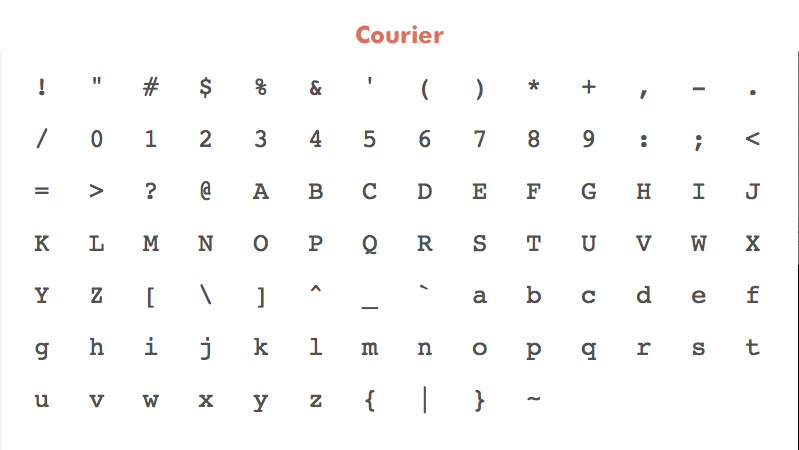
Courier Specimen
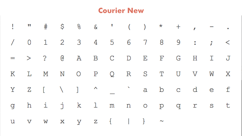
Courier New Specimen
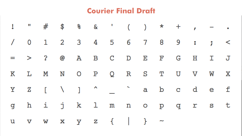
Courier Final Draft Specimen
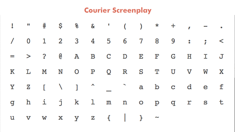
Courier Screenplay Specimen
(Note on methods: the above character palettes and below closeups are screen grabs from Fontcase. As such the resulting .png files were generated at 72dpi. As such they likely won’t render crisp on retina displays. The last image below of body samples, however, was generated at 300dpi. These images are meant merely to be illustrative.)
The main recognizable difference is that “Courier New” is significantly thinner than the rest. I laid the fonts over one another the find other glaring differences, but the truth is that, save for a few items like “Courier Final Draft’s” more modern ampersand or “Courier’s” titled octothorpe, they are all quite similar.
In order to get a closer look, I blew up the lowercase m glyph for each font and placed them next to one another:
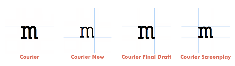
Courier m Glyphs
The thinness of “Courier New” becomes more pronounced when you look at it up close. “Courier Final Draft” appears to be a slightly shaved down (or molded, really) version of “Courier” while “Courier Screenplay” is more squat. Of course, that’s only looking at a single glyph.
Here is a classic excerpt from Lawrence Kasdan’s script for Raiders of the Lost Ark3 set in all four fonts at 12 point. The width, accordingly, is set around 432 point (I think I added a point or two), or the equivalent of six inches on a printed page, the amount allotted to action blocks in screenplay formatting.
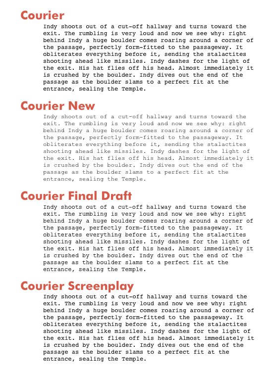
Courier Body Samples
As you can see, Roland Stroud’s rule of thumb holds true. Each paragraph looks identical on a macro level. The ragged right edge matches the copy of the printed Raiders script I have exactly, so if we’re looking for simulacrum, any of these fonts will suffice.
“Courier New” looks almost unreadable on my screen. While it may look crisp on a printed page, it’s too thin to use in a text editor. To my eye, “Courier” and “Courier Screenplay” look much stronger at 12 point than “Courier Final Draft.” However, the fonts render with slightly different heights. It’s not so apparent here on an image, but if you switch back and forth between the fonts in Sublime Text (or any editor) you’ll start to see the difference.
For me, Courier Screenplay looks the best when editing within Sublime Text, so it’s what I’m going to use when working on scripts (until I change my mind).
As for the defaults in the Sublime Text package, I changed the default font to “Courier” since it’s a system font that all users will be able to load without conflict. Additionally, “Courier” has the most extensive set of glyphs of any of the fonts in question, so non-English writers will want to stick with it.
I’m removing “Courier New” as a pre-set option in Fountain for Sublime Text. Users can easily add it back in, but I think it’s just taking up space in the .sublime-settings file.
“Courier Screenplay” will be the second choice font for users to rely on and the “Courier Final Draft” will remain below it. I wish that Sublime Text supported fallback fonts the way CSS does, but since it doesn’t users will have to manually change the font of choice in the app. Shouldn’t be too hard for screenwriting nerds, though.
One more nerdy change. In the aforementioned Courier piece, Roland Stroud shares this:
The distinguishing feature of a typewriter font was not its typeface, but its pitch, which is the number of characters it makes per inch. […] Two pitches were available: standard 12-point pica, which measured out to 10 characters per inch; and 10-point elite, which measured out to 12 characters per inch.
Since 12-point is the screenplay standard, I’ll take Stroud’s measurement of ten characters per inch and multiply it by our six-inches of action slug on a traditional screenplay page: sixty characters per line. The Fountain package specifies the width of the text column in characters (and moves it to the center).
The text column width is now set by default to sixty-one characters (sixty didn’t look right) which lines up nicely with a printed screenplay. The Raiders excerpt, for example, looks identical in Sublime Text as it does on a printed page. Since this width is in characters, you are free to change the font size, or font for that matter, and the column should grow accordingly.
Okay, I think that’s enough on Courier for one day. Back to writing, maybe.
-
The rules of screenplay formatting work because of the 1 page=1 minute rule but, come on, we’ve got supercomputers and such; can’t we come up with a way to count approximate screen time without relying on words stuffed in a 8.5x11" rectangle? ↩︎
-
While we’re on the subject, if anyone wants to let me know how Pitch looks in Sublime Text (or wants to gift me a license) I’m quite curious. ↩︎
-
The opening sequence of Raiders is a shining example of “show, don’t tell” screenwriting. It’s almost all long action blocks (a screenwriting class no-no) and just as thrilling a read as wathing the actual film. ↩︎